GigHQ.ai

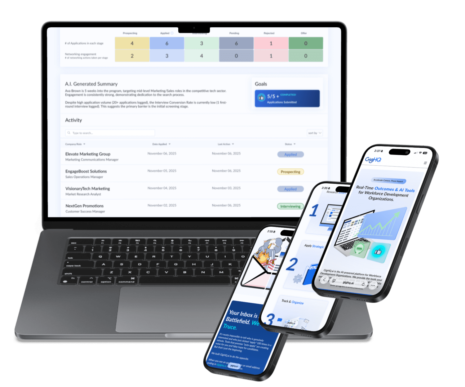
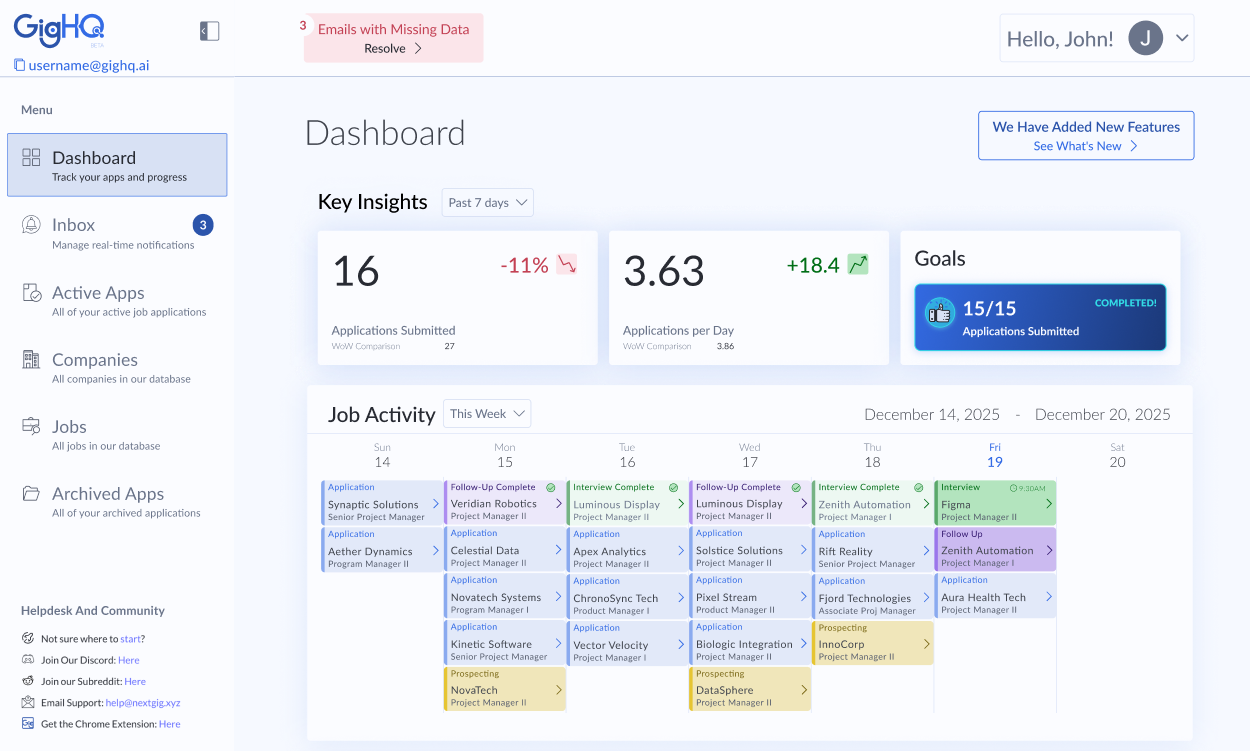
I served as the Lead Designer for GigHQ.ai, responsible for transforming the product from an idea into a complete, market-ready ecosystem. My scope covered the full product lifecycle, including establishing the foundational brand identity, building a comprehensive Design System, and designing the entire user experience across the core web dashboard, promotional website, and proprietary Chrome Extension.

Role
Lead Designer
Tools
Figma, CSS/HTML (Conceptual), Adobe Creative Suite
Skills
Product Strategy, Design Systems, Stakeholder Management, Prototyping, User Flow and Task Analysis, Risk Mitigation, Dashboard Design, Visual Design
Year
2025
Key Results & Testimonials

38

%

By standardizing components, new page builds moved to production 38% faster while ensuring total visual consistency.

2

x

Faster High-Fi Sprints - Accelerated the path from concept to user testing.

- 30

%

Faster Completion for User Onboarding via Pattern Recognition by leveraging a library of familiar UI patterns, thus reducing the user's learning curve.

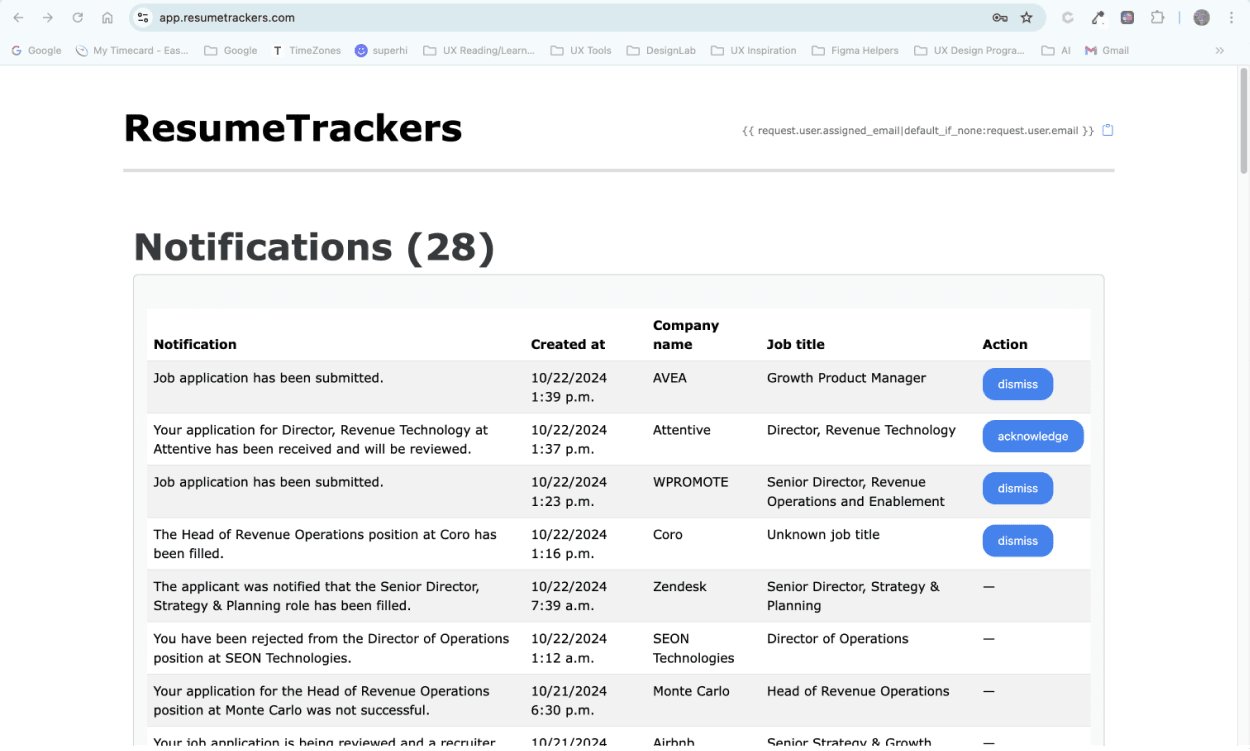
I used to rely on a cumbersome spreadsheet template to manage my job applications. Discovering GigHQ.ai was a game-changer! It transformed my chaotic tracking process into a streamlined, almost effortless experience.

John M.

Successful Real-World Stress Tests

Deployed rapid prototypes for partnership pilot programs to gather early-stage user feedback. These test runs will provide critical data on workforce management workflows, allowing the team to iterate on core features before the full-scale platform launch.

From 10/2024 to Current
Click the pink 'When I was Brought On' button or slide the slider right to see the 'Original Dash' image. Click the pink 'Current Dash' button or slide the slider left to see the 'Current Dash' image.
When I was Brought On
Current Dash
Project Overview

Bridging the Gap from Technology to User

Objective
To leverage system design principles to drive product maturity and efficiency. By developing a comprehensive Design System and utilizing pre-development validation for critical features (Onboarding and Admin Expansion), the goal was to mitigate technical debt and significantly reduce development risk.
Challenge
Achieving a stable, consistent, and scalable launch with a lean team and tight seed-stage budget. This required a strategic approach to mitigate development risk and ensure a cohesive user experience across all platforms.
Defining the Problem

Operationalizing Design: Scaling Through Systemization

Engineering Efficiency & Design Scale.

Challenge: Lack of a unified Design System slowed velocity and created inconsistent, high-debt features.
Attempting to Solve
The Problem

Engineering Efficiency & Design Scale.

Challenge: Lack of a unified Design System slowed velocity and created inconsistent, high-debt features.
Attempted Solution

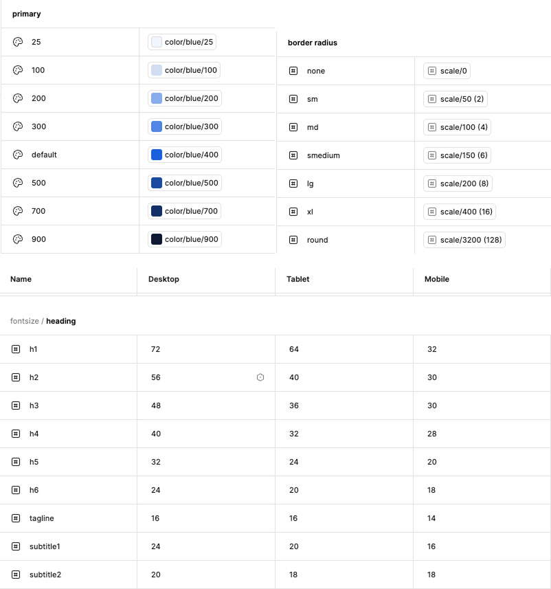
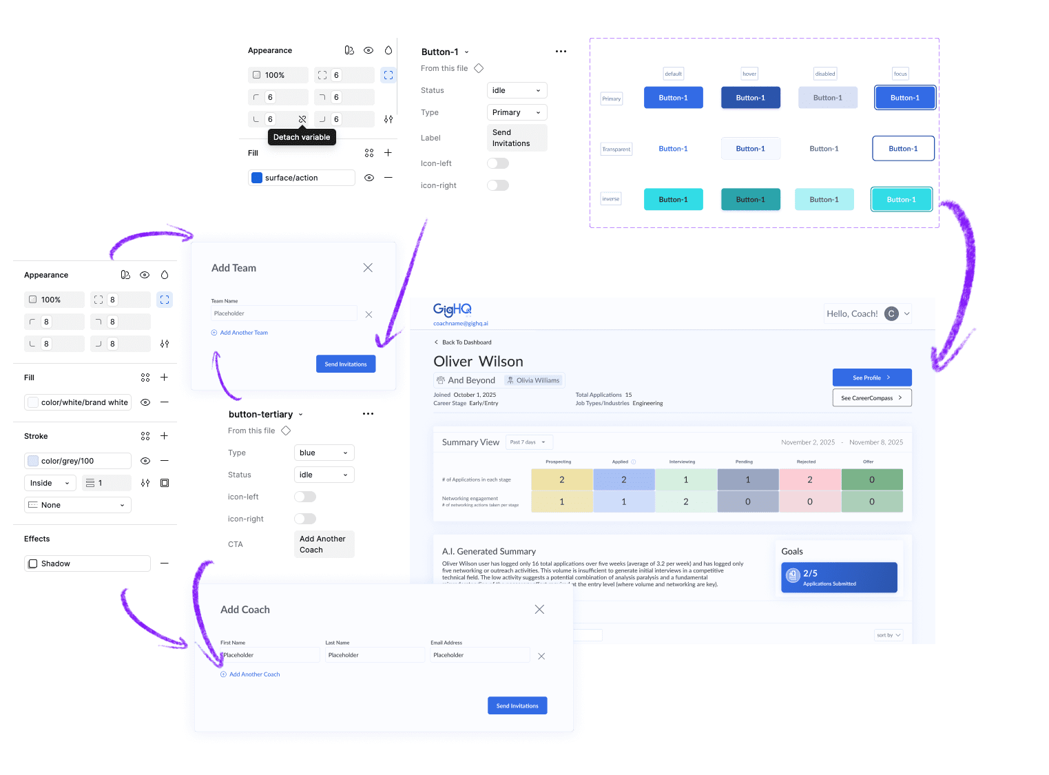
Create a Cohesive Design System

The primary purpose of developing the GigHQ.ai Design System was risk mitigation and accelerated development velocity. With a lean team and the pressures of the seed-stage funding timeline, we faced the risk of rapidly accumulating technical debt due to fragmented, inconsistent UI code.

The Design System was essential to:

1.
Guarantee Consistency
Ensure that the user experience (UX) remained cohesive across the main Dashboard, the marketing Website, and the Chrome Extension.
2.
Prevent Rework
Eliminate the need for engineers to spend time guessing colors, typography, or spacing, and prevent designers from creating bespoke elements for every screen.
3.
Establish Trust
Create a professional, polished brand presence essential for attracting investment and building user confidence in an AI-powered tool.

1. Guaranteeing Consistency

Established the visual language as code, ensuring predictability and saving engineers time spent hunting for values. I did this by defining the core palette, typography, and spacing variables as Design Tokens.

Color Palette
I established a foundational, monochromatic palette centered on blue (#336BE5) to anchor the brand. Over time, we strategically introduced complementary accent colors to improve accessibility and highlight key information within the evolving dashboard.

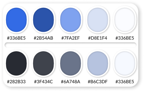
The color palette established:

Trust and Reliability: Blue is widely associated with trust, dependability, and authority.
Focus and Clarity: This specific shade has enough saturation to feel energetic but isn't overly bright, promoting a sense of calm focus and clarity—essential for complex data visualization.
Contrast: It has high enough contrast to be easily accessible as a primary color
Typography
To ensure maximum readability and a low maintenance overhead for the evolving dashboard, I adopted a mono-font strategy. By selecting Lato, which is a single, highly legible typeface that is suitable for both content text and heading levels.

This strategy established:

Reduced Cognitive Load: A uniform visual language eliminates confusion and focuses the user's attention solely on the data.
Streamlined Development: Using only one font reduces complexity, eliminates potential conflicts, and saves costs associated with licensing and asset management.
Future-Proofing: The design system is highly resilient to changes, as updates only need to be managed for a single typeface.
Tokenization

This elimnated:

The need for engineers to spend time guessing colors, typography, border radius, or spacing.

2. Preventing Rework

A product’s first iteration is rarely its final form. Recognizing that the roadmap for GigHQ would evolve, I designed the UI with "Anticipatory Architecture." Instead of building rigid, fixed-purpose layouts, I utilized a system of Flexible Containers and modular grids.

This forward-thinking approach ensures the interface can gracefully absorb future data—such as advanced analytics, new student metrics, or third-party integrations—without requiring a total structural overhaul. By designing for scalability from day one, we've eliminated future design debt and ensured the platform remains cohesive as it grows from a startup tool into a comprehensive "command center."

Designer Efficiency
(The Lego Kit)
No more "pixel pushing" or recreating basic elements. This prevents design rework.
Future-Proofing
(Scalable Architecture)
A product is never "finished." I designed GigHQ’s core layouts with intentional flexibility. Instead of rigid, fixed-height containers, we utilized a modular grid that allows the product to evolve. This prevents structural rework.

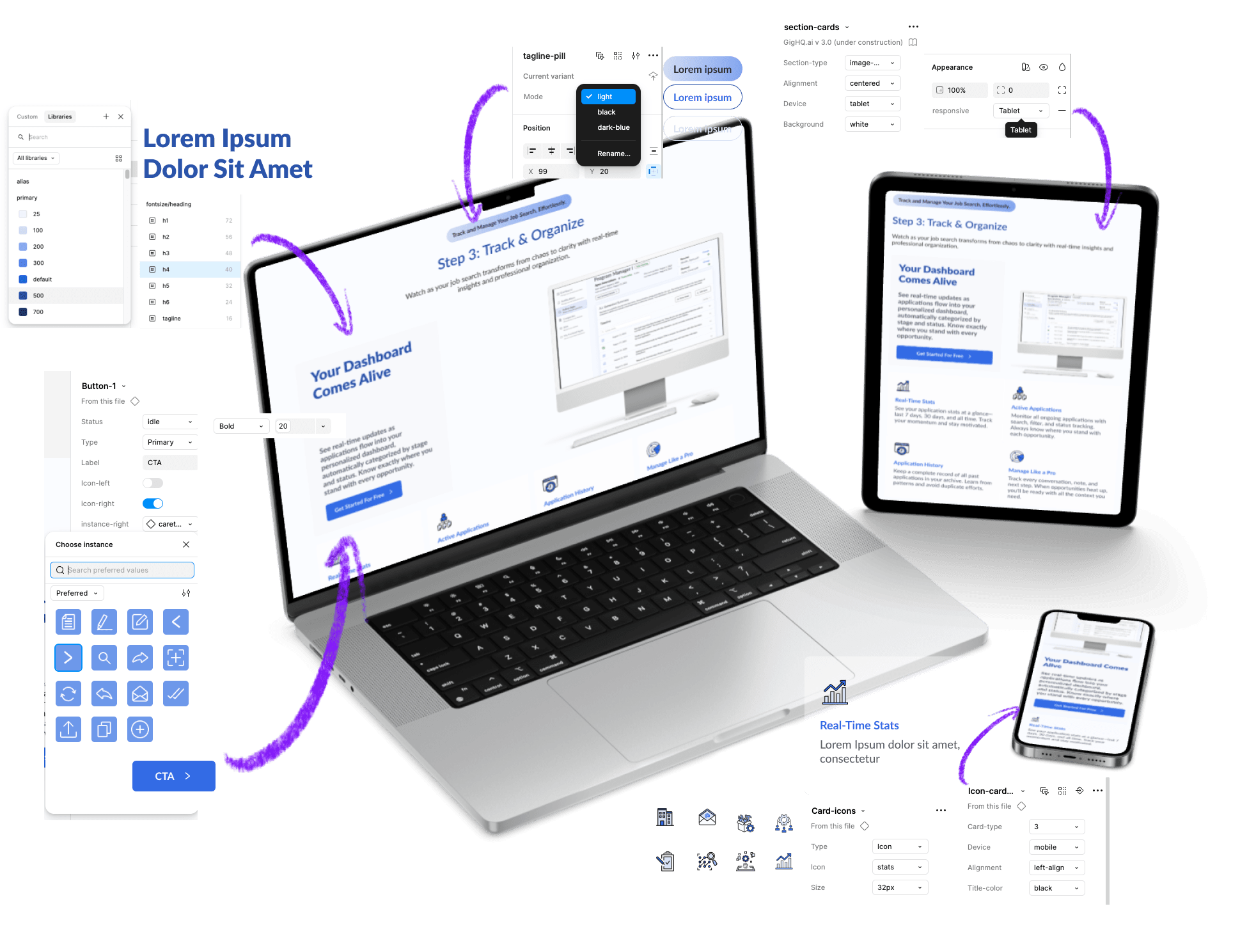
Designed to Scale By Using:

Dynamic Components: Modals and cards are built to expand vertically or horizontally without losing their professional polish.
System Elasticity: By establishing a logic for how elements stack and grow, we've ensured that Version 3.0 will feel just as cohesive as Version 1.0.

The Benefit:

Future feature releases will require zero layout redesigns, only the creation of new sub-components.

3. Establishing Trust

Building trust in AI requires more than just accurate data; it requires a transparent and predictable interface. To overcome the 'trust deficit' common in AI tools, the design system centered on clarity and precision.

Precision over flair
In an administrative tool, "delight" comes from accuracy and efficiency, not flashy animations. We prioritized clean lines, rigorous alignment, and a sober color palette to signal that the data being presented is precise and reliable.

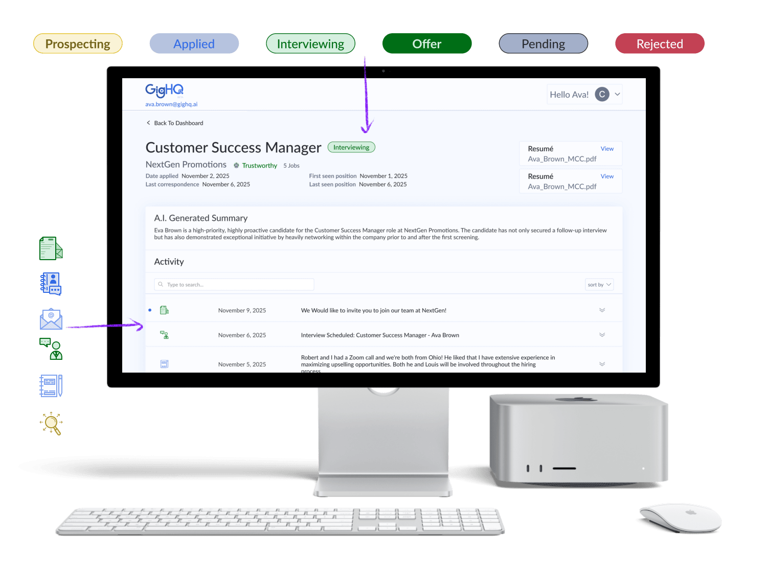
This Communicates the platform and AI is:

Disciplined
Accurate
Stable
Transparency Over Magic
Our system avoids "magical" interactions in favor of clear, explainable data. Whether it's a resumé match score or profile strength, the UI always provides context so the user understands the why behind the AI’s suggestion.

Building User Trust:

Clarity is the antidote to skepticism: Users trust what they can understand.
Predictability Through Patterns
A cohesive system means the user never has to re-learn a behavior. By strictly standardizing every component—from button radii to shadow depths—we created a predictable visual language.

The uniformity signals:

A mature, institutional-grade product, rather than a collection of disconnected features.
How Did This Solve the Problem?

Professionalism as a Proxy for Performance

For an AI-driven platform like GigHQ, design is more than aesthetics—it’s the primary driver of user confidence. To attract serious investors and enterprise partners, we needed to move beyond "MVP-style" visuals and establish an institutional-grade brand presence.

The Outcome:

Investor Readiness

Developed a "Pitch-Perfect" UI that emphasizes data clarity and structural maturity, allowing stakeholders to focus on the technology’s value rather than its "rough edges."

User Confidence

By utilizing a disciplined typographic hierarchy and a stable color palette, we reduced the "perceived risk" for users entering sensitive student and workforce data.

Brand Continuity

Codified a visual language that remains consistent across all modules, signaling a level of operational excellence that mirrors the sophistication of our AI.
Admin Prototype

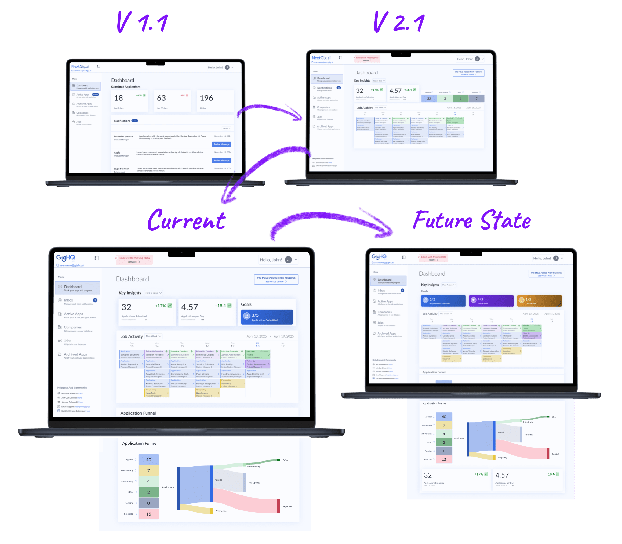
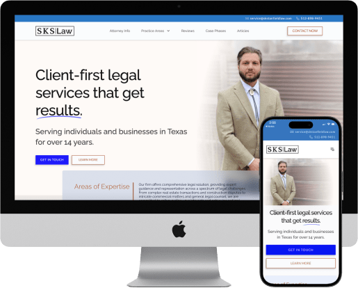
Strategic Pilot MVP: Accelerating Partnership Acquisitions

To support high-stakes business development, I executed a 4-day design sprint to deliver a high-fidelity admin dashboard for GigHQ.ai. By leveraging 1:1 component parity, I translated complex workforce data into a "trial-ready" MVP. This rapid prototype served as the core pilot for partner meetings, enabling the team to demonstrate platform value and secure immediate trial commitments with large-scale organizations.

Reflection

The "Force Multiplier" Effect

This project reinforced that a design system’s true value isn't just visual consistency—it’s operational agility. By investing in 1:1 component parity early on, we transformed the design process from a bottleneck into a force multiplier. Completing an enterprise-grade prototype in four days was only possible because the "small decisions" (typography, spacing, input logic) had already been solved, allowing me to focus entirely on high-level user flow and business logic.

Looking Beyond the Present: Scaling the Ecosystem
Looking to the Future As GigHQ.ai continues to secure new partnerships, the focus shifts from creation to governance.
Next Steps & Future Decisions
My Next Objectives Include:

Advanced Design Tokens

Implementing a multi-brand token system to allow the dashboard to be white-labeled for different partners in minutes.

Quantitative Refinement

Leveraging our existing usage analytics to identify "high-friction" components. By analyzing where developers most frequently detach components or where UI bugs persist, I can prioritize library updates based on actual production data.
More Case Studies
UX/UI Design

SKS Law

A responsive and strategic web redesign for the Austin-based law firm maximizes user benefits while balancing business needs.

View Case Study
UX/UI Design

AdiFit

This in-app feature, developed as a conceptual project for my UX design bootcamp, takes the guesswork out of online shoe shopping, helping users find the right fit and style for their needs.

View Case Study